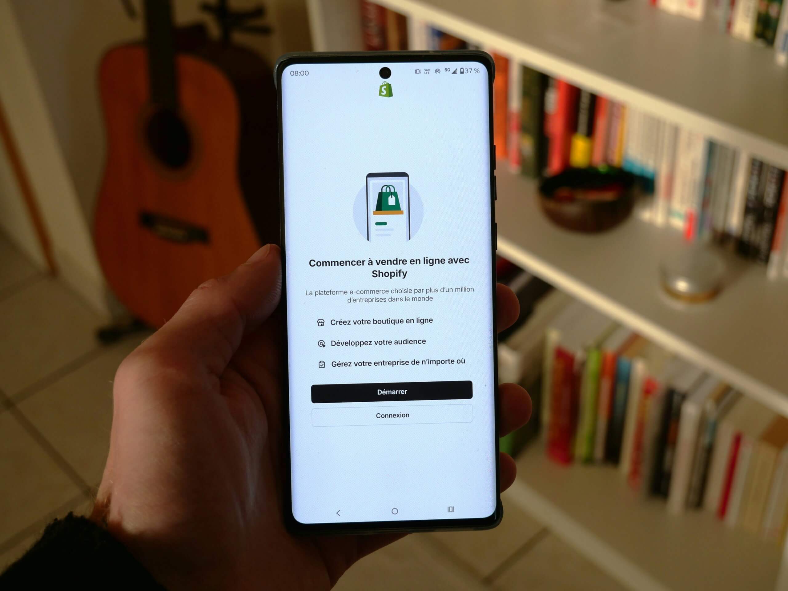
More shoppers reach for a phone than a laptop when they browse, compare, and buy. During Cyber Week 2024, roughly seventy per cent of online sales came from mobile devices. Search engines also judge performance on the mobile version first. Treating mobile as an afterthought hurts revenue and rankings, yet many stores still focus on desktop layouts and hope responsive breakpoints will cover the gap. Below, you will find practical steps to create faster, smoother mobile experiences on any platform, with examples for Magento and Shopify.
Google’s mobile-first index uses the smartphone view as the primary ranking source. If a page loads slowly or hides critical content on mobile, rankings and visibility suffer. Shoppers are equally impatient. Research from Deloitte shows that a one-second improvement in mobile load speed can raise conversion rates by eight per cent. Faster pages also lower bounce rates and keep customers engaged.
Begin with a flexible grid that adapts smoothly across screen sizes. Avoid desktop elements that rely on hover states, since fingers cannot hover. Keep text legible by setting a base font size of at least sixteen pixels and using relative units like rem for scalability. In Magento, select a mobile-ready theme or update the theme’s CSS to ensure breakpoints trigger around 360 pixels wide. Shopify stores can audit templates in the theme editor, checking that headers shrink, menus collapse into a clear icon, and buttons stay visible without horizontal scrolling.
Large images and excessive JavaScript are common culprits. Use WebP or AVIF images and serve them through a content delivery network with automatic compression. Minify CSS and JavaScript bundles, then defer non-critical scripts until after the first render. Both Magento and Shopify support lazy loading with the loading=”lazy” attribute, which delays off-screen images until the user scrolls. If the store relies on external widgets, only load them on pages where they are needed instead of every template.
A progressive web app (PWA) wraps your site in a fast, app-like shell that caches assets locally and enables near instant navigation. Magento’s PWA Studio provides starter themes and build scripts so developers can convert the store gradually. Shopify offers Hydrogen for storefronts that can be paired with a headless PWA front end. Alternatively, Accelerated Mobile Pages (AMP) can deliver ultra-light product pages that load in under one second, although AMP limits custom scripts and styling.
Navigation elements should sit within easy reach of a thumb, typically the lower centre or lower right area of the screen. Increase tap targets to at least forty-four pixels square to prevent mis-taps. Place add-to-cart buttons above the fold on product pages, and ensure the cart icon remains sticky as users scroll. During checkout, show numeric keypads for phone numbers and credit card fields by setting the correct input types.
Run Google Lighthouse or PageSpeed Insights on key templates to measure mobile performance scores. Aim for a Largest Contentful Paint under two and a half seconds and a cumulative layout shift below 0.1. Track mobile conversion rates separately in analytics software, then compare against desktop. If mobile lags, trace drop-off points in the funnel report. Regular audits keep the site aligned with new device standards and browser updates.
Mobile commerce is no longer a growing slice of online sales; it is the largest. Prioritising responsive layouts, image optimisation, modern frameworks like PWA, and thumb-friendly interfaces turns casual mobile visitors into loyal buyers while protecting search visibility. Begin with a speed audit, tackle the biggest performance blockers, and iterate toward a seamless phone-first experience.
Ready to build a better e-commerce shop? Contact MageMontreal today to get expert Magento and Shopify mobile optimisation solutions that drive results.